Client
CrimsonCrimson is a professional photolab & digital printer. Their customer segment ranges from the photo enthusiast to the big exhibitors and museums.
Project
2015
As an AD I was responsible for all things communication and marketing at Crimson. I recognised the opportunity to broaden the target audience to not only the photographer segment but also the arty artists, illustrators and graphic designers. The aim for all ads produced by and for Crimson was profiling and brand awareness rather than promoting single products.
Process
Ads series
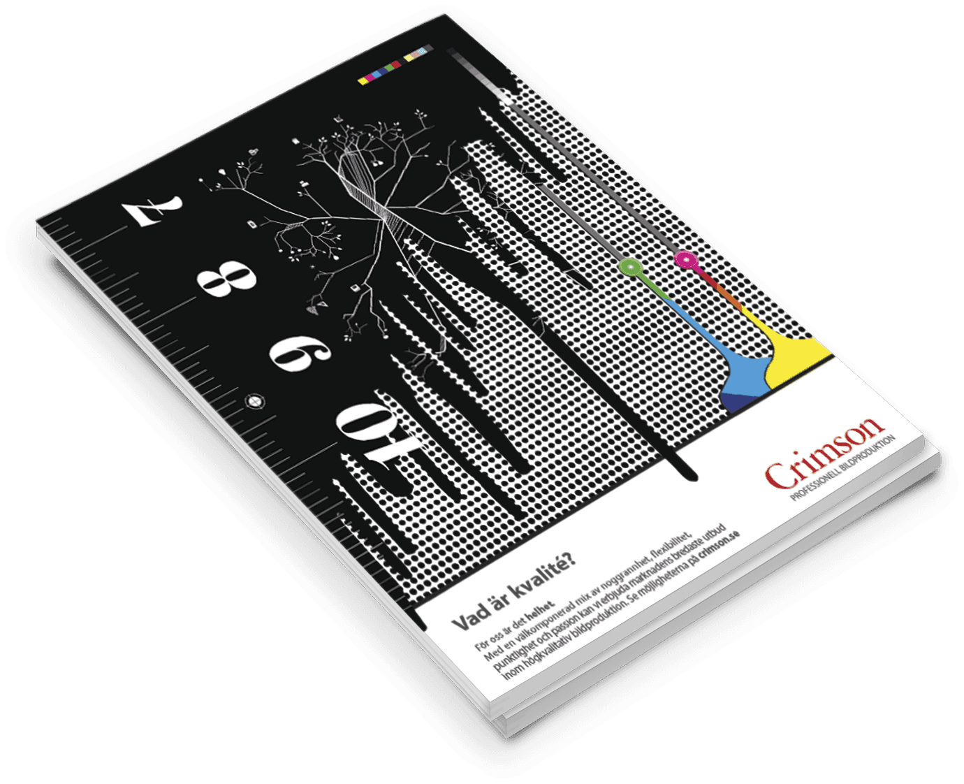
In this series we illustrated the key values of the company. The ads were customised to fit the audience of the magazine Cap & Design. I truly loved the whole process, from creating the concept to fine-tuning the illustrations
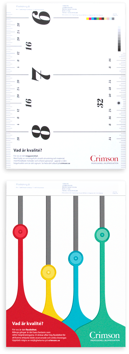
- Accuracy
- To represent accuracy we used what the target audience was familiar with - color proofing, cropmarks and margins.
- Consistency
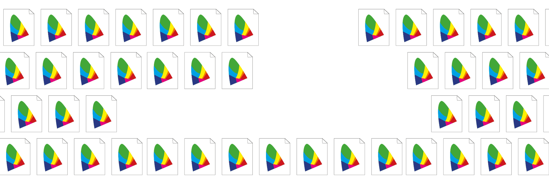
- To illustrate the consistency in deliverables we picked up the icon for icc profile.
- Flexibility
- To show the powerful possibilities of customising the product such as change saturation, levels, add frames and so on.
- Punctuality
- It was important to convey the understanding and respect Crimson has for their clients deadlines.
- Diversity
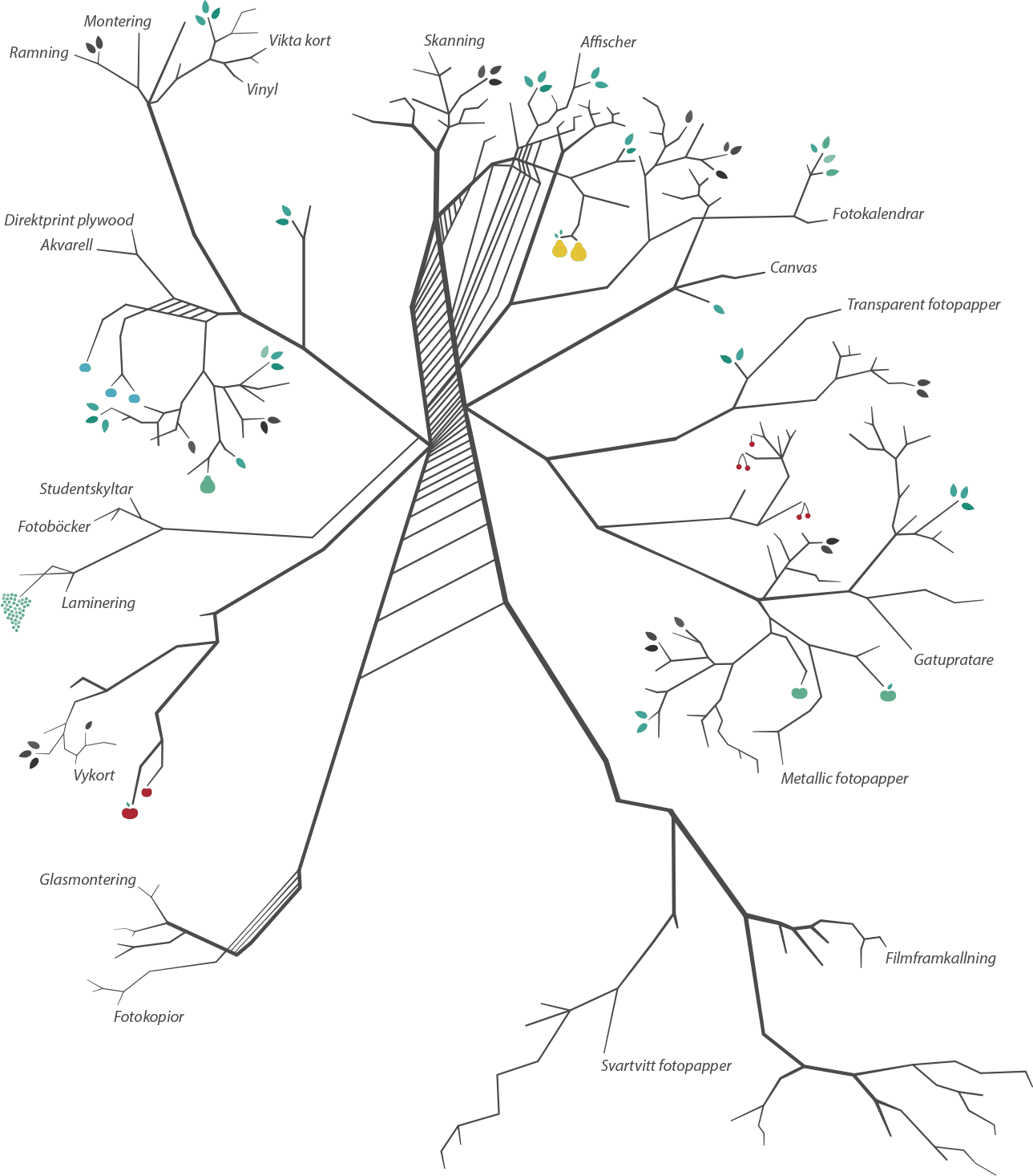
- How do you illustrate diversity? You list, print, branch out and grow roots - right.
- Passion
- Passion - the essence of nerdiness. Designers are usually very nerdy about their cause. It was easy to just look within in this regard. Color, space, typography, hex-text, you name it.
- Experience
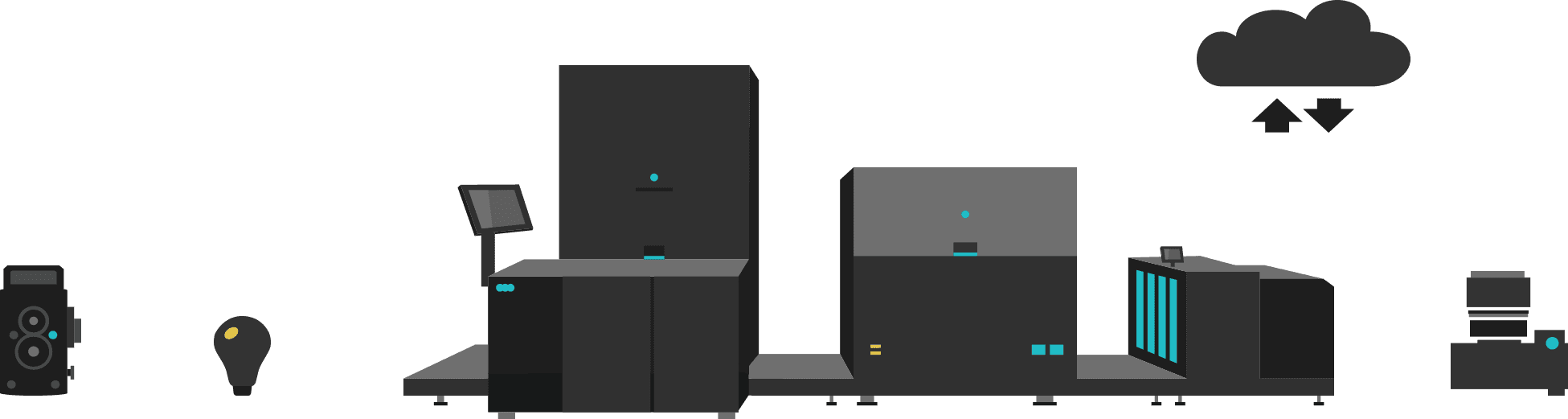
- A challenge, how do you illustrate experience? We did it by bringing light on both old and new technologies, while also always keep the work in focus.
- Unity
- The grand finale - a combination of all key values, or value illustrations.
Summary
This was just so much fun and I enjoyed every second. In addition - the result very appreciated by both the publisher of the magazine and the readers. Score!